The newly designed AccuWeather For Business Portal will provide a customized, interactive space to have all your global weather hazard components and risk mitigation tools in one place. The Portal’s Map, an easy-to-use, robust and reliable situational awareness tool, will provide fast access to live lightning strikes, official local storm reports, and high-resolution Doppler radar.
With tools to upload your own hazardous weather response plan into warning notifications, the Portal will be outfitted to support your business at all stages when disaster threatens and strikes:
• Audible alarm and visual cue when warning issued for client location(s) to get attention when seconds count
• Ability to acknowledge warnings with a click of a button to ensure timely receipt
• Forecasts and current conditions for locations worldwide, including the unique AccuWeather MinuteCast® and hour-by-hour forecasts.
The UI/UX team was challenged to develop a simple and unobtrusive single underlying system that allows for a omni-channel experience across existing and future platforms. A visual language that fuses the principles of user centered design with innovative thinking. I helped oversee and manage the process and outcome of the group effort to bring all our disparate styles and designs into one, coherent and unified system.
GOALS: Create a visual language that fuses the principles of user centered design with innovative thinking, emerging technologies, and science.
Develop a single underlying system that allows for a unified experience across existing and future platforms and any screen size. A unified experience builds user trust. Trust builds habits. Habits build brands.
These Design Guidelines were created with one main goal:
Be as simple and unobtrusive as possible.
Do not get in the users way, do not make them think, do not make them ask questions. Let them get to their desired content as quickly and simply as possible.
• Generous use of white space and productive emptiness.
• Designed and crafted down to the last detail.
• Make the product more understandable and useful.
• Sustainable, easily updatable and iterable.
• Extensible, cross platform and scalable.
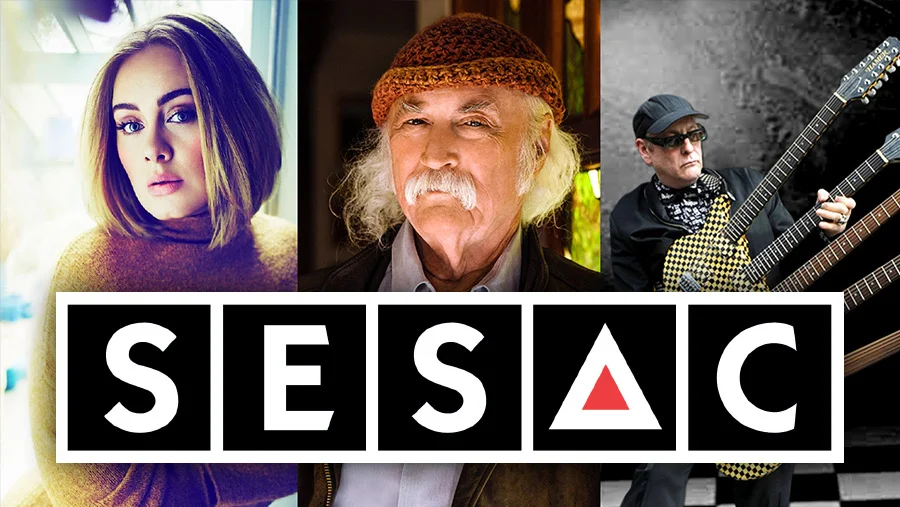
SESAC is a performing rights organization that represents the world's top songwriters, composers and music publishers. They represent over 400,000 songs on behalf of its 30,000 affiliates which include such familiar names as Bob Dylan, Neil Diamond, RUSH, Zac Brown, Mumford & Sons, Lady Antebellum, along with the music on some of TV’s biggest shows including Grey’s Anatomy, How I Met Your Mother, Parenthood, Dateline NBC, Dr. Phil, and Seinfeld.
SESAC both collects and pays music royalties to their clients, and had an archaic and barely functional B2B system. I was hired to perform all UX and UI duties for the redesign, working with PMs and Devs both local and offshore. Together we re-architected the experience from the ground up, taking into account user feedback/pain points as well as business priorities.
Inheriting an existing front-facing website and its' brand design system, I incorporated that visual system into a new one that still felt like the existing site, but with a more elegant and sophisticated execution.
Case study:
NFL- Legal Sports Betting Fantasy Platform
After a few initial conversations with the VP of Fantasy and Product I was tasked with a hypothetical platform if the NFL wanted to get into the legal gambling space. I had to define a position/philosophy for the NFL in the gaming space, create the UX patterns and entry points for the user, and design the UI to align with the existing Fantasy app structure.
I presented my recommendations, my sketches, and finally the final designs to the NFL executives so they could use this concept to have some initial discussions about getting into the gaming space.
Case study:
NFL- Game Pass Domestic - Subscription Streaming Service
NFL Game Pass Domestic is a subscription streaming service available to U.S. customers only. This was a complete rebuild and relaunch of the Game Pass App.
The service is available on mobile and tablet, desktop and Connected TV devices.
NFL Game Pass gives customers access to full and condensed game replays, Coaches Film, live out-of-market preseason games, live game audio, and live local and primetime Regular Season and Postseason games on your phone or tablet. It has since been rebranded as NFL+ Premium.
I was the principal product designer on the team that included a UX researcher, Product Manager, Project Manager, front and back end engineering teams, video integration team members, stakeholders from promotion and sales and VP level Game Pass executives.
Screens shown below represent the on-boarding flow from landing page and account creation to subscription and authorization flows for customers.
Beginning in 2018 I began consulting with Accuweather on their ongoing browser redesign project, working on the UI/UX of the new components and overall design system.
A teledoc/teleconferencing browser product for DemandForce and Internet Brands clients. Integrated with DemandForce’s appointment and client system for ease of use.
Tasked with supplying a new digital media initiative for the 2015-16 season we hired 4 artists/motion designers to help support the NFL Now team with graphics and motion artwork.
We designed green screen sets, custom one-off illustrations, and maybe most importantly, developed a comprehensive catalogue of on-air graphics that can be displayed showing nearly all that needs to be illustrated. Charts, Data visualizations, statistics, schedules, etc. Virtually anything needed (think Sports Center) but maintaining a visual style that would stay true to the products much younger, millenial audience
With the emergence of social media as a business and content priority I was tasked to hire and oversee a dedicated team of artist(s) to support the new NFL Digital Media social team.
Focusing on season-long arcs we were able to maintain consistency and cohesiveness while working collaboratively with the content team. To ensure we could spend more time on larger, special projects we developed a thorough set of templates to covered most of the day to day needs of the content team. Their photo editors could utilize our templates with minimal adjustments and education, allowing our team to focus on the larger, more time intensive custom illustrations.
Tasked with designing & building both a complimentary browser, iOS and Android experience for SCORE BIG to purchase tickets for concerts & sporting events across the nation.
NOTE: slide 6 and on are mobile views!
An early redesign for NFL.com for the 2015 season. Due to leadership and priorities changes, these were never built.
3 versions - both desktop and mobile versions
Startup company that focused on searchable sports facts and stats for die-hard fanatics to research sports information.
Responsively designed web product
These were the initial designs for the first ever-PS4 native app for the NFL
What began as an exercise in redesigning the NFL Fantasy Football Draft Client ended up becoming NFL Fantasy Perfect Challenge - a game on in its own right with a million dollar prize.
When tasked with redesigning the existing player pages we followed our user testing data to use team colors for the background as well as link colors.
Universally successful with fans upon interview
When asked to redesign the schedules/Scores page we incorporated the individual team helmets as well as the weather effect on them. Individual Teams were granted team-colored backgrounds to enhance their fans experience (as tested).